Peyton Manning put on a show on Monday Night Football this week, beating the Dolphins despite just 15 minutes of possession, but can he keep it up? The graph below shows Peyton’s touchdown passes from 2004-2008:
Eyeballing the graph, the conclusion seems obvious: Peyton’s skills are in a steady decline. With all the time he spends doing hilarious commercials, his prowess as a quarterback is cooling off.
Of course, the problem with this graph is that it omits the full record of Peyton’s career. Here’s a more accurate graph covering a longer time range:
When you look at Peyton’s full career, it’s clear that the apparent drop off in touchdowns from 2004-2008 does not represent a long-term trend of declining skills. Rather, 2004 was a (then) record-setting aberration from an otherwise steady trend of consistent, excellent performance. If you start with the year before or after 2004, the long-term trend is apparent. But by “cherry-picking” 2004 as the starting point for my analysis of Peyton’s career, I can make it look like he’s on the decline.
I’m writing this because the sleight of hand I pulled in fabricating Peyton Manning’s imminent demise is a standard tactic used to promulgate a common misconception about global warming (most recently appearing in yesterday’s New York Times): that global warming stopped in 1998.
To show how this trickery is done, here’s a graph of global temperatures since 1998, as recorded by NASA:
2005 is slightly warmer than 1998, but it looks as though temperatures are relatively flat. Plus, 2008 is cooler than 1998, so you could conceivably argue that the earth has cooled since 1998. But you’ve seen with Peyton Manning how cherry-picking an outlying year can distort a long-term trend, so let’s see what happens if you start from the years on either side of 1998.
Starting with 1999, the trend looks like this:
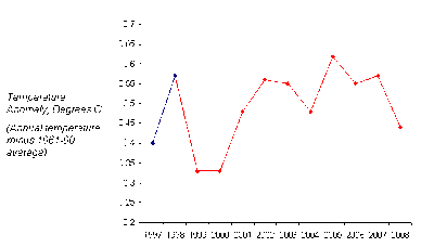
Do you see global cooling? Neither do I. Similarly, starting from 1997, you get this:
In both graphs, the warming trend is immediately obvious, and in both cases, 2008 is warmer than the starting year. Go back another ten years to 1988, and the trend is even clearer:
The reason 1998 is a bad year to start any analysis of temperature is that 1998 saw the strongest El Nino on record, which pushed temperatures far above the long-term trend. (El Nino is Spanish for “The Nino.”) Just like Peyton Manning’s touchdown explosion in 2004, 1998 was an exceptionally hot year on top of an existing warming trend. Similarly, 2008 is a bad year to end a climate analysis because it saw a strong La Nina, pushing the annual temperature below the trend. If you start with an aberrationally hot year, and end with an aberrationally cool year, you artificially understate the warming trend.
Global warming hasn’t stopped since 1998. Rather, by choosing your starting and ending years carefully, you can create the appearance of a break in the long-term trend, but it’s only an illusion. To get the full picture, I’ll leave you with an image of temperatures since recordings began in the late 1800s:
The graph is full of periods of steady or cooling temperatures, but they are always followed by even greater warming. Are you really willing to take a chance that 2008 will be any different?
RELATED POSTS:
Obama speaks on global warming: What you need to know to be certain that global warming is real
Visualizing the "costs" of cap-and-trade
Global warming goes on monkey trial!


well post, i was looking the same information to write global warming essay.
ReplyDelete